What do you wear to a Photoshoot Session
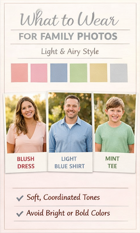
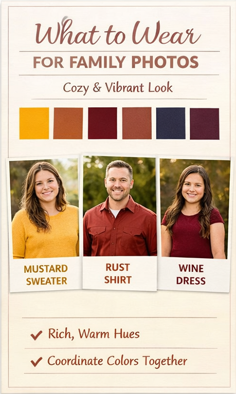
Here are 3 colour charts as a guide to the best colours to wear when you go to a photoshoot with Danders Photography
Colour Charts.
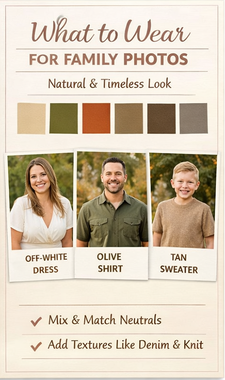
Earthy tones are one of the best choices for family photography because they create a timeless, natural, and beautifully coordinated look without feeling forced.
Colours like soft browns, creams, olive greens, tans, and muted rust tones blend effortlessly with outdoor settings—whether you’re in a park, by the water, or surrounded by fall leaves. Instead of competing with the background, these tones complement nature, allowing your family to feel like part of the scene rather than standing out in a distracting way.
Another big advantage is how earthy colours photograph on camera. Bright or bold colours can reflect harsh light or pull attention away from faces, but neutral tones help keep the focus where it belongs—on your connection, expressions, and emotions. This results in images that feel warm, genuine, and relaxed.
Earthy palettes also make coordinating outfits much easier. Instead of matching exactly (which can look stiff), family members can wear different shades within the same colour range. This creates a cohesive look with depth and texture, especially when layering fabrics like knits, denim, or linen.
Most importantly, earthy tones are timeless. Trends come and go, but natural colours never feel outdated. Years from now, your photos will still look just as beautiful and relevant as the day they were taken.
In short, wearing earthy colours helps create photos that are:
 Natural and flattering
Emotion-focused
Easy to coordinate
Timeless and elegant
That’s why they’re a go-to choice for creating stunning, lasting family memories 
Advertisements